Do you know some people experience difficulty reading or understanding information when we use certain colors to format text in a document, webpage, or captioned video?
Meeting the color contrast requirement ensures the visual presentation of text and images of text has a contrast ratio of at least 4.5:1, except for the following:
- Large Text: Large-scale text and images of large-scale text have a contrast ratio of at least 3:1.
- Incidental: Text or images of text that are part of an inactive user interface component, pure decoration, not visible to anyone, or part of a picture that contains significant other visual content have no contrast requirement.
- Logotypes: Text that is part of a logo or brand name has no contrast requirement.
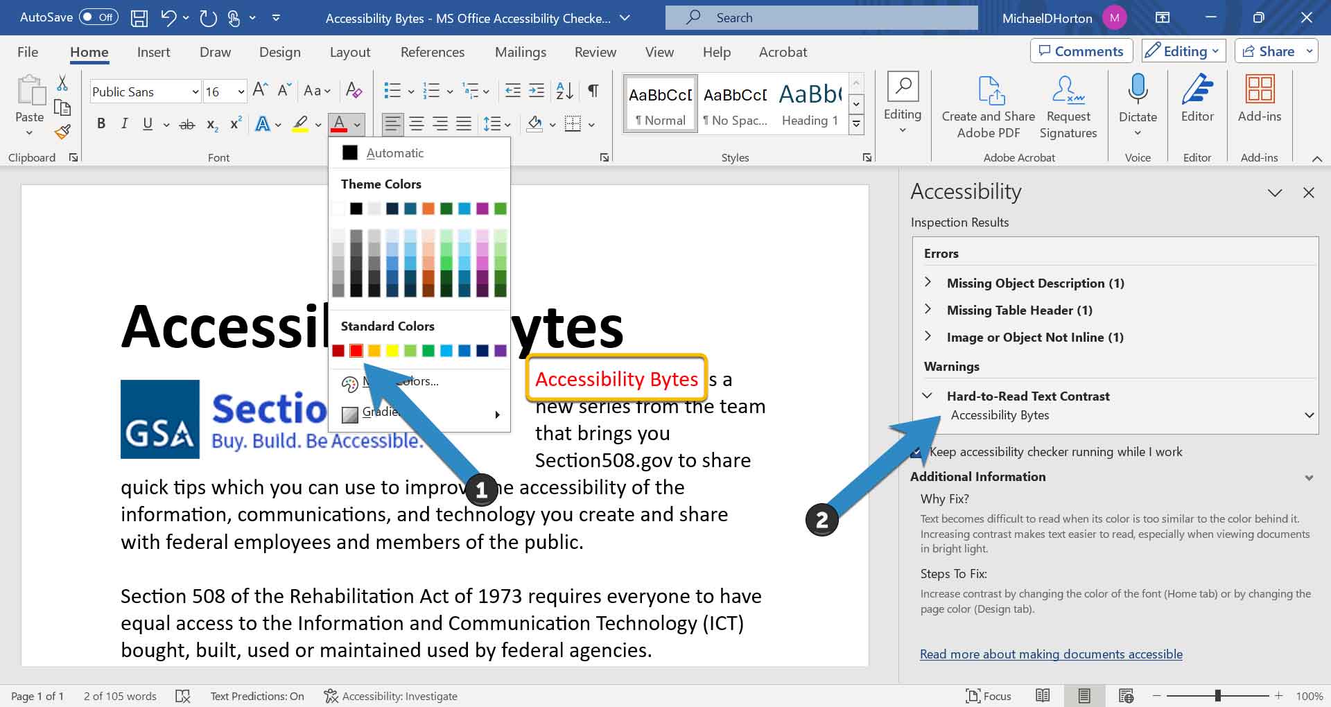
Many modern authoring or content creation tools include ways to ensure the color of your text has sufficient contrast. In Microsoft Word, simply run the Accessibility Checker—either while authoring or after—and a warning will appear if your text is “hard to read.”
To fix this error, simply update the text color to a higher contrasting version of the color you desire, which may require a darker or lighter selection. Conversely, you may choose to change the background color instead. Once changed to a sufficient color, you should notice the “warning” has cleared.
NOTE: The color “Red” in many Microsoft applications fails to meet the minimum contrast standard. Suggest selecting and using “Dark Red” instead.

For additional information on color standards and testing tools, see:
- Functional Performance Criteria 302.3 Without Perception of Color | Access-Board.gov
- How to Test Color Contrast using the Color Contrast Analyser (Video)
- WCAG 1.4.2 Contrast (Minimum) | W3.org
- ANDI Video Training - Module 13: Color Contrast (Video)
Still have questions? Reach out to your agency’s Section 508 Program Manager or contact us at Section.508@gsa.gov.


