Did you know that accessible forms should help people avoid mistakes and understand how to fix them?
Forms are everywhere. We use them to register for events, request services, search for information, submit applications, and complete everyday tasks.
When a form requires information in a particular format or a user makes a mistake, clear instructions and error messages can help prevent incorrect information from being entered, reduce frustration, and help users successfully complete the form.

Provide Instructions Before They’re Needed
If a form field has special requirements, use form labels or instructions to tell users what they need to know before they enter the information.
For example, if a date must be entered in a particular format, don’t make users guess.
Instructions are especially important when information must follow a particular format, meet specific requirements, or be entered in an unexpected way.
Don’t wait until someone makes a mistake to explain what you wanted them to do.
Make Error Messages Helpful
We all make mistakes when completing forms. A good error message should help users understand what went wrong and how to fix it.
The goal isn’t simply to tell users that something went wrong. Give them the information they need to fix it.
Make Errors Easy to Find
When a form contains an error, users should be able to determine where the error occurred.
Clearly indicate the field or fields that need attention. If several errors occur, consider providing a summary that helps users find each problem.
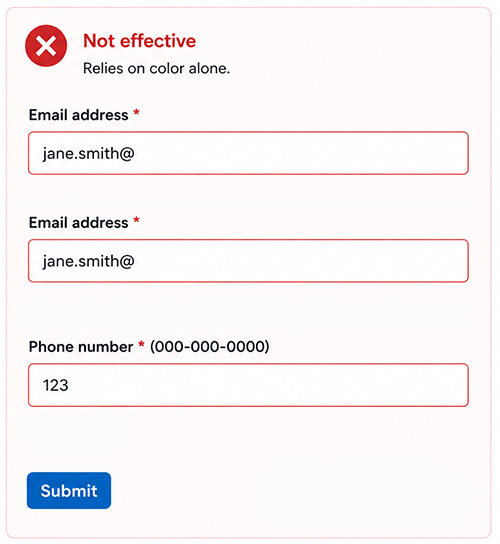
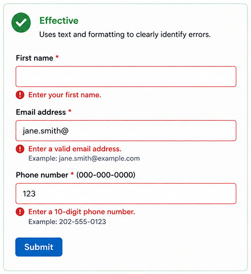
Don’t rely only on color to identify errors.
For example, changing a field’s border to red may not be enough. Include text that identifies the problem so users don’t have to recognize the use of color or color contrast to know something went wrong (Figure 2).
Use Plain Language
Error messages and instructions should be written for the people completing the form — not for the system processing it.
Avoid technical language, error codes, or internal terminology that users may not understand.
Clear instructions and error messages benefit everyone, including people with cognitive disabilities, people using assistive technology, and people who are unfamiliar with the information being requested.
Try It Yourself
The next time you create or review a form, look at its instructions and intentionally make a few mistakes.
Ask yourself:
If you answer no to any of these questions, you may have identified an accessibility issue.
Key Takeaways
Help users get it right the first time by providing clear instructions before they’re needed.
When mistakes happen, don’t just tell users that something went wrong. Tell them what happened, where it happened, and how to fix it.
Good instructions prevent errors. Good error messages help people recover from them.
For more information on creating accessible web-based forms, visit WebAIM: Usable and Accessible Form Validation and Error Recovery.