Purpose of Alternative Text
Alternative text, also known as alt text, is descriptive text that conveys the meaning of an image in digital content. It’s designed to make visual content accessible to people with vision disabilities.
When a person uses assistive technology such as a screen reader, the screen reader will read the onscreen text aloud. When the screen reader reaches an image, it will read the alt text for that image so the user can know what the image is meant to convey. Images can provide illustrative information, or they can act as buttons and similar interactive elements, so the alt text must describe these aspects to the user so they can respond appropriately.
Without alt text, people who use screen readers cannot access the content provided in the images. This is why alt text is a requirement in the Section 508 guidelines for creating digital content.
Additionally, alt text makes content accessible to other users, like those who may have difficulty understanding the meaning of the visual content, or users without access to high-speed internet who cannot access images on the web. It also makes the visual content available for technical applications, such as Search Engine Optimization (SEO), digital assistance, and artificial intelligence.
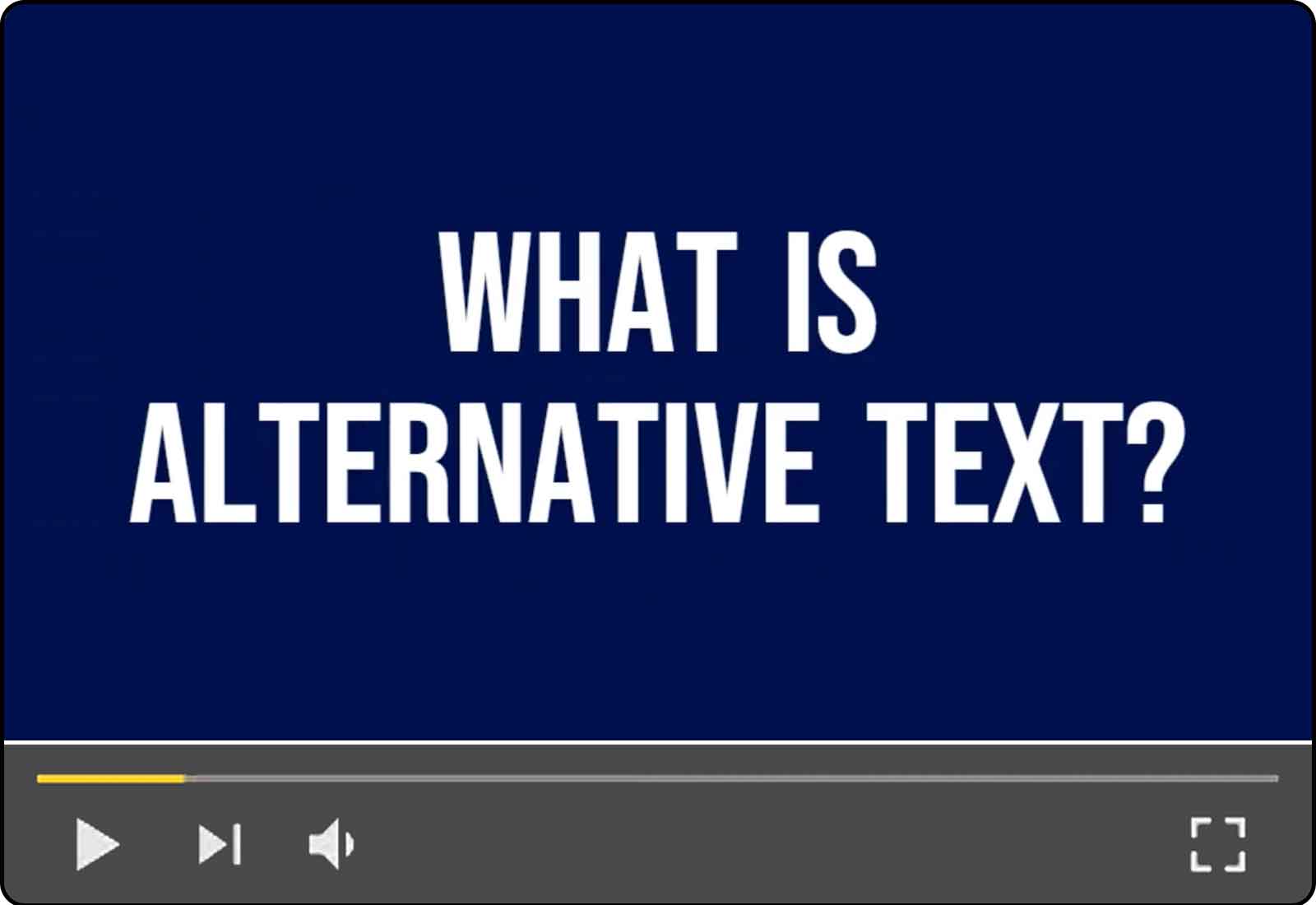
Alternative text, also known as alt text, is descriptive text that conveys the meaning of an image in digital content. It’s designed to make visual content accessible to people with vision disabilities. While there are other benefits of alt text for all users, this video focuses on people who use screen readers.
Duration 3m 25s | 1-Part Video Tutorial
Resources on How to Add Alt Text
- Microsoft Word - Create Accessible Images and Other Objects
- Microsoft PowerPoint - Adding Alternative Text to Images and Other Objects
- Microsoft Excel - Adding Alternative Text to Images and Other Objects
- PDF - Remediating PDFs for Accessibility
- Web Development/HTML - W3.org Images Tutorial
General Guidelines
When writing alt text, follow these guidelines:
- Alt text should be short and to the point.
- Alt text should communicate the same information as the visual content.
- Alt text should refer to relevant content provided by the image, rather than simply describing how the image looks.
- Alt text should not contain any extra or unnecessary information, and should not repeat information that is already provided in the text.
- Alt text must be in the same language as the main content. For example, if you translate an English document into Spanish, you must also translate the alt text into Spanish.
Specific Guidelines
Photos and Portraits
Describe the content of the photo that is relevant to the surrounding context. Instead of describing how the image looks, describe what information is being conveyed.
Example for Photos and Portraits

- Helpful: “Dr. Martin Luther King Jr.”
- Unhelpful: “Black and white photo of Dr. Martin Luther King Jr. wearing a suit and tie.”
Images that Contain Text
When possible, do not include text as part of an image. Instead, type the text in the document and adjust the formatting of the text until it has the desired appearance.
If you have an image that does contain text, include it in the alt text word for word.
Example for Images that Contain Text

- Helpful: “Card with text: Acquisition training for the real world - Jan 29th-Feb 9th. 1:00 PM - 2:00 PM EST - Register today.”
- Unhelpful: “Event details with registration button”
Logos
Logos are never decorative, so they require alt text. Describe any significant symbols or graphics, and include any text in the logo word for word in the alt text.
Example for Logos

- Helpful: “GSA logo with text: Section508.gov Buy. Build. Be Accessible.”
- Unhelpful: “Logo”
Decorative Images
If an image does not contain information that is necessary for the reader to understand the main content and is pure decoration or is used only for visual formatting, it is decorative. Many programs allow you to select whether an image is decorative or indicate to screen readers that they should skip this image. Note that if you fail to set the alt text to decorative, a screen reader may read the file name for the image rather than skip the image altogether as intended.
Example for Decorative Images
- Helpful: Image is set to “decorative” and no alt text is needed.
Note: Only the laptop here is being considered an image. The text in this example would need to be actual text, rather than part of the image itself. - Unhelpful: Alt text says, “person typing on a laptop.”
- Unhelpful: Image has no alt text, but is not set to decorative, so screen readers read the file name of the image instead.
Background Images
Many programs skip background images in screen reader descriptions. If a background image contains important information, include it in the main content rather than keeping it in the background, and add the appropriate alt text. If the image is decorative, confirm during testing that it is skipped in screen reader descriptions.
In documents created in Microsoft Word, screen readers skip all headers and footers as if they were background images. Any non-decorative images (and essential text content) must be in the main page content to ensure they are read by screen readers.
Example for Background Images

- Helpful: Image is formatted as a background image and is automatically skipped by screen readers
Note: In all cases, the text in this example would need to be actual text that is not part of the image itself. - Helpful: Image is included in the main content, but is indicated as “decorative” and is skipped by screen readers
- Unhelpful: alt=”a white keyboard”
Example for Document Headers

- Helpful: Move the logo image and other header text to the main page content and add alt text that says “GSA logo.”
- Unhelpful: The logo and agency name stay in the document header and are not read by a screen reader.
Controls, Form Elements, and Links
When possible, render controls and other navigation elements as text and avoid using images to convey navigation information. Be careful when using images with these elements to ensure they are still accessible for keyboard navigation and understandable for screen reader users.
For more guidance, see the “Additional Resources” section at the end of this guide.
Example for Controls
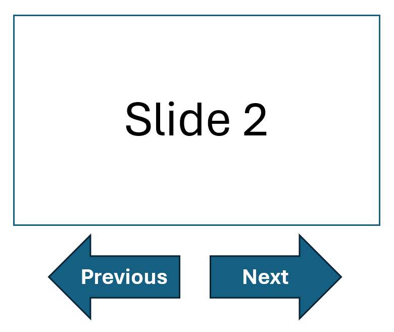
- Helpful: Screen reader reads links that say “Next” and “Previous” and arrow images are set as “decorative”
- Helpful: Screen reader reads “Next arrow button” and “Previous arrow button”
- Unhelpful: “Right arrow” and “Left arrow”
Example for Form Elements
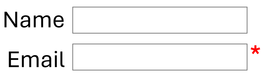
- Helpful: Red asterisk is incorporated as part of the label text so no image with alt text is required
- Helpful: Alt text for red asterisk says “Required”
- Unhelpful: Alt text for red asterisk says “Asterisk” or “Star”
- Unhelpful: Red asterisk image has no alt text
Bullets
Document and web content creators should add bulleted lists from the application toolbar and unordered list element respectively, and avoid manually creating bulleted (or numbered) lists. Most screen readers will read bulleted lists as “bullet,” regardless of what shape or image is used for the bullet point. If you must use an image in place of a bullet point, set the alt text to reflect that it is being used as a bullet point. In some cases, the image used for the bullet point conveys meaning, in which case the alt text should indicate that meaning. For example, if you have a list of checked and unchecked boxes, use alt text like “checkbox checked” and “checkbox unchecked.”
Example for Bullet Points
Activities Covered by Section 508
- Development
- Procurement
- Use
- Maintenance
- Helpful: Screen reader says “bullet” and its position in the list before each item in the list
- Unhelpful: Screen reader says “right arrow” before each item in the list
Spacers and Separators
Spacers and similar structural images are decorative and should be marked as decorative so that they are skipped by screen readers.
Lines and separators are typically decorative, especially if you are using headers to appropriately organize your content. If separators are used to convey a meaning or serve as a functional image used to initiate action or prompt a response, the alt text must provide the same information conveyed visually.
Charts, Graphs, and Diagrams
For complex images, such as flowcharts, graphs, diagrams, and infographics, follow these guidelines:
- Describe what type of chart or diagram is being used. For example, start your alt text with phrases like “Pie chart” or “Bar graph.”
- Consider the purpose of the image within the context of the surrounding content. Describe important data trends, relationships, and other parts of the image that are being highlighted.
- Avoid repeating parts of the main text in the alt text. For example, if a paragraph under a bar chart describes the trends, you do not need to repeat this description in the alt text.
- Avoid overly long descriptions in the alt text. If the image is very detailed and requires a longer description, include a short description in the alt text, then beneath the image, provide a link to the data table or a longer description of the graphic.
Example for Charts
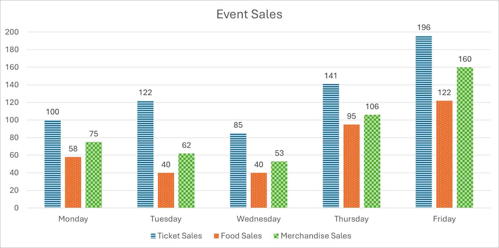
- Helpful: “Bar chart of event sales for Monday through Friday. Amounts for ticket, food, and merchandise sales show a slight decline from Monday to Wednesday, with a dramatic increase to a peak on Friday. Full data set: Monday: ticket sales 100, food sales 58, merchandise sales 75. Tuesday: ticket sales 122, food sales 40, merchandise sales 62. Wednesday: ticket sales 85, food sales 40, merchandise sales 53. Thursday: ticket sales 141, food sales 95, merchandise sales 106. Friday: ticket sales 196, food sales 122, merchandise sales 160.”
- Helpful: “Bar chart of event sales for Monday through Friday. Amounts for ticket, food, and merchandise sales show a slight decline from Monday to Wednesday, with a dramatic increase to a peak on Friday. Table 1 further details the event sales by category.”
- Unhelpful: “Event sales graph”
Example for Graphs
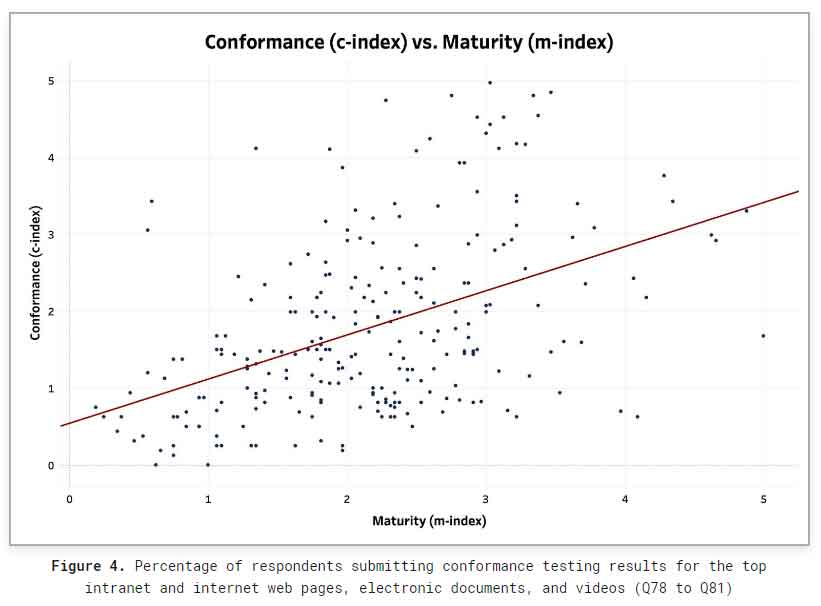
- Helpful: “A scatter plot shows the distribution of agencies on a 0-to-5 scale across the x-axis representing maturity (m-index) and the y-axis representing conformance (c-index), with a heavy concentration of respondents located in the bottom and left of the graph. A dark red trend line shows an upward trend, indicating that, as respondent’s maturity increased, their conformance also generally tended to increase. Table 3 further details the number of respondents who fell into specific brackets.”
Note: This image should be followed by a link to the full data table. - Unhelpful: “Scatter plot of conformance versus maturity”
Example for Diagrams
Flow charts, decision trees, and similar diagrams must have alt text that describes the order of the actions or relationships of decisions. For screen reader users, organizational charts may be better conveyed as a bulleted list, or a graphical diagram accompanied by a bulleted list.
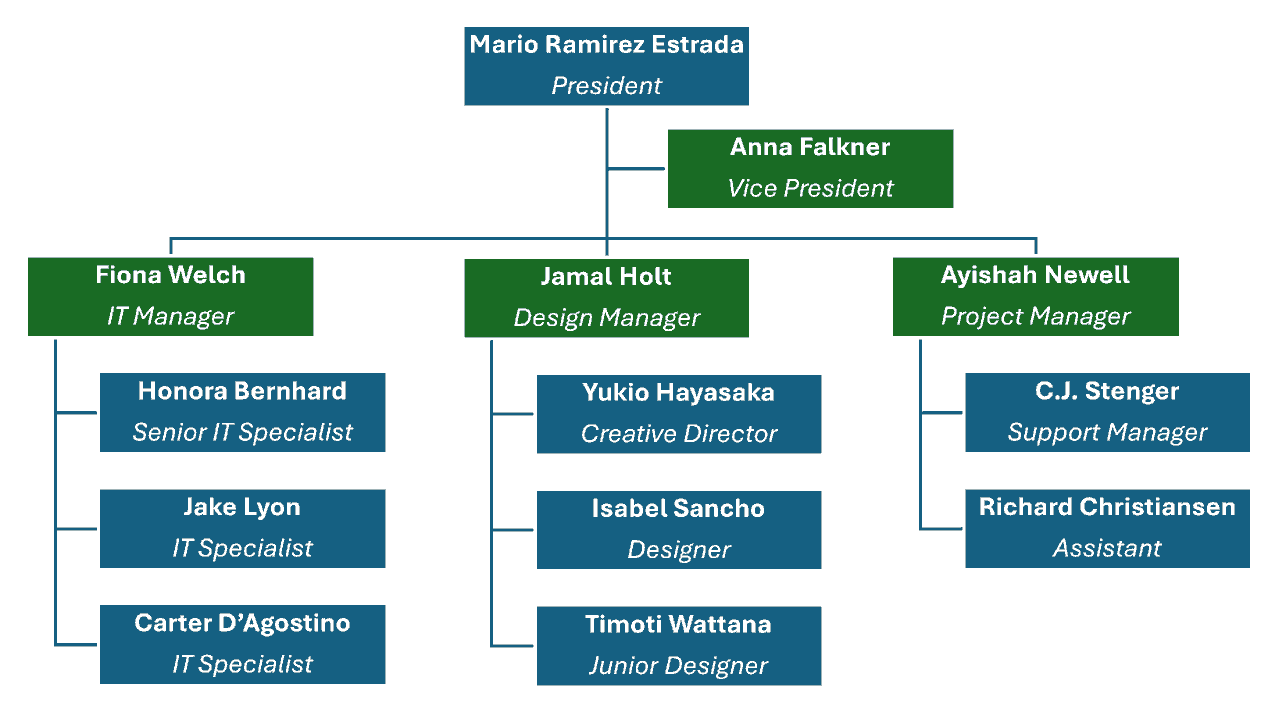
- Helpful: “Organizational chart. Top level: Mario Ramirez Estrada, President. Reporting to Mario Ramirez Estrada: Anna Falkner, Vice President. Group also reporting to Mario Ramirez Estrada: Fiona Welch, IT Manager; Jamal Holt, Design Manager; Ayishah Newell, Project Manager. Reporting to Fiona Welch: Honora Bernhard, Senior IT Specialist; Jake Lyon, IT Specialist; Carter D’Agostino, IT Specialist. Reporting to Jamal Holt: Yukio Hayasaka, Creative Director; Isabel Sancho, Designer; Timoti Wattana, Junior Designer. Reporting to Ayishah Newell: C.J. Stenger, Support Manager; Richard Christiansen, Assistant.”
- Helpful for larger charts: “See the link [insert link name] below the image for a text version of the organizational chart.”
- Unhelpful: “Org chart”
Watermarks
Watermarks are not read by screen readers. If a watermark has relevant information, you must add this information to the main content. For example, if you have a watermark that says “Top Secret,” then you must indicate in the main text that the document is top secret.
If the watermark is decorative, no alt text or additional information is needed.
All watermarks should have low color contrast to make the main text readable for readers with low vision. When possible, avoid using watermarks altogether since they can obscure the main text for users with low vision.
Examples for Watermarks
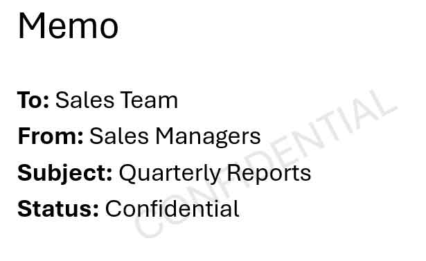

- Helpful: A low-contrast watermark that says “Confidential” is repeated in the “Status” field in the memo.
Note: It is recommended to remove the watermark altogether to avoid issues with color contrast for users with low vision. - Unhelpful: A bright red watermark that says “Confidential” obscures the main content and is not read by a screen reader.
Signatures
When a signature is presented as an image, include the word “Signature” and the signer’s name in the alt text.
Example for Signatures
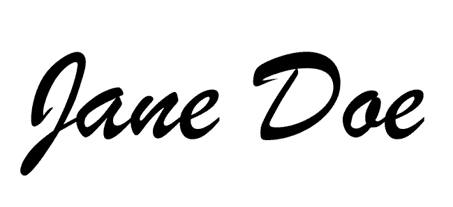
- Helpful: “Signature: Jane Doe”
- Unhelpful: “Jane Doe written in neat cursive”
- Unhelpful: “Signature”
Common Mistakes
Many people who write alt text for images make these common errors:
- The text is too short and doesn’t describe the relevant content of the image.
- The text is too long and describes unnecessary information.
- They write text that visually describes the image, but does not describe the part of the image that directly relates to why the image was included in the content.
- The text repeats information from the main text.
- The alt text is just the image’s file name or path instead of a description.
- The alt text is a computer-generated, visual description of the image, but does not describe the relevant content of the image.
- The alt text is in a different language than the onscreen text. For example, the content of the page is in Spanish, but the alt text for images is in English.
Additional Resources
Refer to the following for additional guidance on writing meaningful alt text.
- Social Security Administration Guide: Alternate Text for Images (PDF)
- WebAIM: Alternative Text
- WebAIM: Alternative Text - Context is Everything