In this resource, you will learn about the importance of color usage in accessibility, and you will learn the tools and techniques you can use to make the colors in your content and information and communication technology (ICT) accessible.
Why is Color Accessibility Important?
Color accessibility means making sure that someone does not need to perceive color in order to understand your information and use your technology, and that the colors you use have a level of color contrast that will allow users to easily discern and read all text and other content.
Using color in an accessible way helps in the following ways:
Disabilities Impacted by Color Usage
Approximately 1 in 12 men and approximately 1 in 200 women experience color blindness (“Color Blindness,” National Eye Institute). When you are color blind, you are unable to perceive or distinguish between certain colors. You may have difficulty distinguishing between shades of red and green, or perceiving the difference between other colors, and may even be unable to distinguish any colors at all. In the following example images, the same colorful picture is vastly different depending on what type and degree of color blindness you may have.


A person with color blindness may be unable to distinguish between the colors in a traffic light, the color coding in a graph, or the color options in a clothing store.
In addition, many people with color blindness or low vision have difficulty perceiving text, icons, and symbols when the color of the object is too similar in shade to the color of the background. The “shade” of a color is how light or dark a color is. The following example images show a navigation menu when the colors are “low contrast,” where the colors are similar shades, and “high contrast,” where the colors are very different shades, along with how each of these images may look to a person with color blindness or low vision. For all types of vision, it is harder to distinguish the icons and text in the low contrast menu than in the high contrast menu.
| Condition | Low Contrast Image | High Contrast Image |
|---|---|---|
| Typical Vision |  |
 |
| Color Blindness |  |
|
| Low Vision |  |
 |
Color Accessibility in Section 508 Conformance
Section 508 Standards list the following functional performance criteria related to color:
This means that in order to be accessible, your ICT must not require the user to be able to distinguish between any colors.
Color Accessibility for Software, Website Content, and Documents
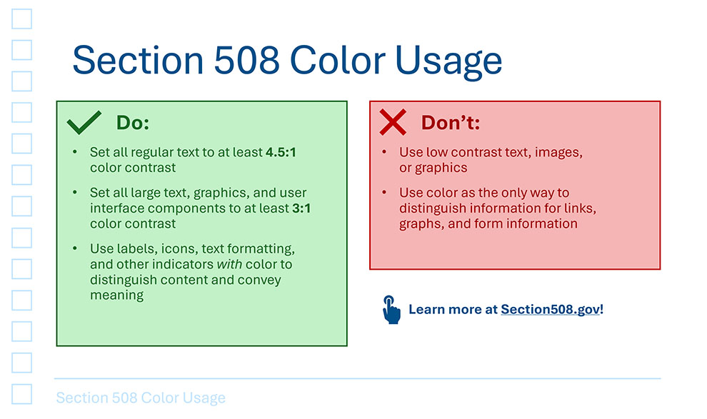
When Section 508 standards apply, all software, web content, and documents must meet the following color usage standards in the Web Content Accessibility Guidelines (WCAG) 2.0 AA:
- WCAG 1.4.1 Use of Color: Color is not used as the only visual means of conveying information, indicating an action, prompting a response, or distinguishing a visual element.
- WCAG 1.4.3 Contrast (Minimum): The visual presentation of text and images of text has a contrast ratio of at least 4.5:1, except for the following:
- Large Text: Large-scale text and images of large-scale text have a contrast ratio of at least 3:1;
- Incidental: Text or images of text that are part of an inactive user interface component, that are pure decoration, that are not visible to anyone, or that are part of a picture that contains significant other visual content, have no contrast requirement.
- Logotypes: Text that is part of a logo or brand name has no contrast requirement.
In addition, the following success criterion is part of the current WCAG 2.1 guidelines, but has not yet been incorporated as a requirement in the Section 508 Standards, which only require agencies to meet WCAG 2.0 AA guidelines. However, many federal agencies follow this success criterion as a best practice.
- WCAG 1.4.11 Non-text Contrast: The visual presentation of the following have a contrast ratio of at least 3:1 against adjacent color(s):
- User Interface Components: Visual information required to identify user interface components and states, except for inactive components or where the appearance of the component is determined by the user agent and not modified by the author;
- Graphical Objects: Parts of graphics required to understand the content, except when a particular presentation of graphics is essential to the information being conveyed.
In the following sections, you will learn what techniques and tools you can use to make your color usage accessible for all audiences.
Color Accessibility for Hardware ICT
The Section 508 standards state that when your ICT involves hardware, it must meet the standard 407.2 for Color Contrast:
While there is no specific color contrast threshold for hardware, a best practice is to use color contrast standards comparable to those used for electronic content (302.5).
Making Accessible Content with Color Usage
Avoiding Color Dependency
Avoiding color dependency means ensuring that a user is not required to be able to perceive different colors in order to understand and use your ICT. You can still use color to help accentuate or emphasize certain content, but it cannot be the only way you communicate information to viewers. Review each of the following sections to see examples of how to meet this requirement for different types of content.
Using Color: Text and Lists
If you emphasize or highlight certain content using color, you can avoid color dependency by also including a text label that communicates the same meaning. For example, in the following quiz question answer key, the correct answer is indicated with green text. However, color blind users may not be able to perceive this difference, so this sample text is inaccessible.
- Sample question
- Option A
- Option B
- Option C
- Option D
In this revised example, the answer key indicates the correct answer both by marking it in green text and by adding a label marking it as “Correct.”
- Sample question
- Option A
- Option B (Correct)
- Option C
- Option D
Using Color: Links
Color must not be the only way you convey that a piece of text functions as a link. The commonly accepted best practice is to format your link with an underline and a different text color. Inaccessible example: Section 508 website Accessible example: Section 508 website
Using Color: Forms, Buttons, and Interactive Elements
All forms, buttons, and interactive elements must not require the user to be able to perceive or distinguish between colors. In this example form, the input fields with errors are marked in red. However, this requires the user to be able to distinguish between colors, so it is inaccessible.
In this corrected example, the fields with errors each have a warning icon in addition to the light red background. As a best practice, they have also added messages that indicate how to correct each error.
Using Color: Graphs and Charts
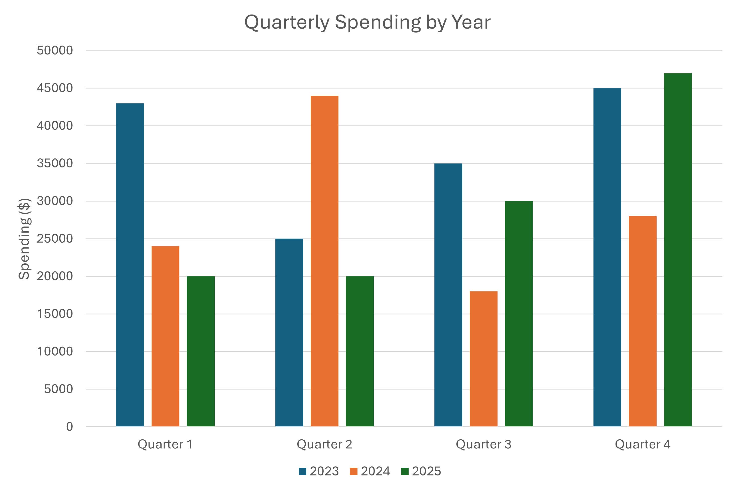
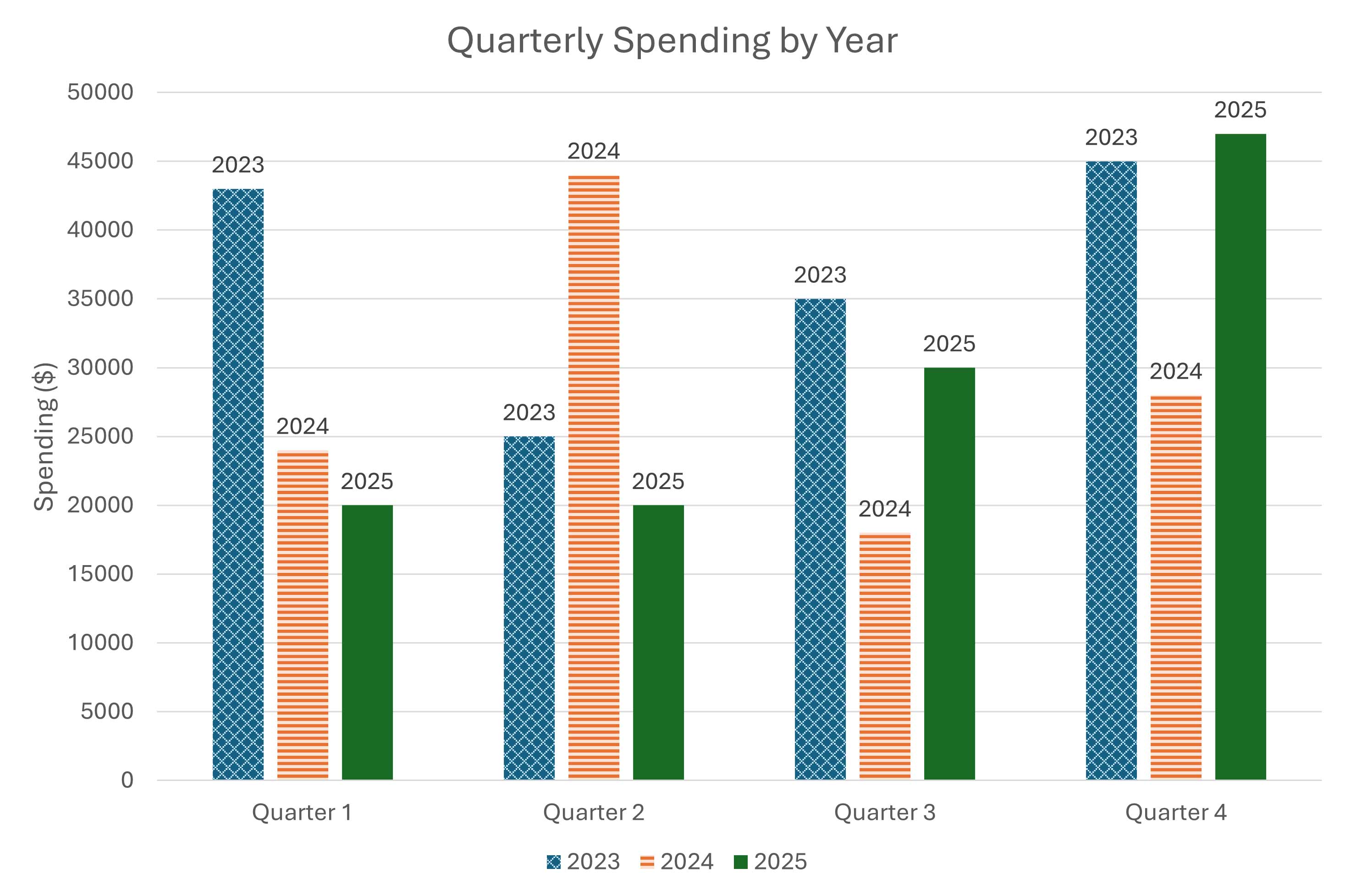
Graphs and charts often have the option to use color to distinguish between different groups of data and include a color-coded legend. However, to be fully accessible, these graphs and charts must use patterns, labels, or other indicators besides color to make these distinctions. For our examples, let’s make a bar graph using data from the following sample table: Quarterly Spending by Year
| Quarter | 2023 | 2024 | 2025 |
|---|---|---|---|
| Quarter 1 | 43,000 | 24,000 | 20,000 |
| Quarter 2 | 25,000 | 44,000 | 20,000 |
| Quarter 3 | 35,000 | 18,000 | 30,000 |
| Quarter 4 | 45,000 | 28,000 | 47,000 |
In this inaccessible bar graph, the bars are only distinguishable by the colors used.
In this corrected example, the bars are each in different colors, but they also have different patterns and have text labels to further clarify which bars belong to which data set. Adding these distinctions makes this graph’s color usage accessible.
Measuring and Checking Color Contrast
Color contrast is measured as a ratio that reflects how different the luminance (lightness or darkness) of one color is from another. In accessibility, this typically means comparing foreground content—like text, icons, or essential images—with the background it sits on. It’s important to note that this measurement is based on brightness, not how the colors might appear to people with normal or corrected color vision.
Because our eyes and screens perceive color differently—and because visual judgment is unreliable for contrast—the most accurate way to check color contrast is to locate and verify the programmatic HEX or RGB color values rather than sampling the colors.
Tools like ANDI* inspect the programmatic color values, while WebAIM* and Colour Contrast Analyser (CCA)* use color samples to calculate the color contrast ratio and tell you whether it meets the required accessibility standards such as WCAG 2.1 AA or AAA.
Watch the following videos to learn more about how to use each of these commonly used color contrast checking tools: ANDI, WebAIM and CCA.
Accessible Name & Description Inspector (ANDI) Color Contrast
In Module 13 of the Accessible Name & Description Inspector (ANDI) Tool video series, learn how to use the Color Contrast module to programmatically determined whether text in a webpage has enough contrast with its background to be readable by people with moderately low vision—especially those who do not typically use contrast-enhancing assistive technology.
Duration 2m 9s | Module 13 of an 18-Part Video Series
How to Use the Color Contrast Analyzer (CCA)
In this video, we’ll show you how to use the Colour Contrast Analyser (CCA) and the programmatic color values—or HEX codes—to check contrast between text, images of text, and background colors in digital content and documents. This tool is especially useful when automated tools like ANDI can’t programmatically determined contrast issues, or when a standalone application is preferred.
Duration 6m 07s | 1-Part Video Tutorial
How to Use the WebAIM Contrast Checker
In this video, you’ll learn how to use WebAIM’s Contrast Checker to evaluate the contrast between text—or images of text—and background colors in documents. This tool is especially helpful when contrast issues can’t be programmatically determined by tools like ANDI or when those tools aren’t available.
Duration 5m 22s | 1-Part Video Tutorial
How to Test Color Contrast using the Color Contrast Analyser (CCA)
In Module: 14 of the Accessible Name & Description Inspector (ANDI) Tool video series, learn how to use the Color Contrast Analyzer's (CCA) built-in color sampler to ensure the contrast ratio between text, and images of text, and it's background is sufficient. CCA can be used to when contrast cannot programmatically determined by ANDI.
Duration 2m 33s | 1-Part Video Tutorial
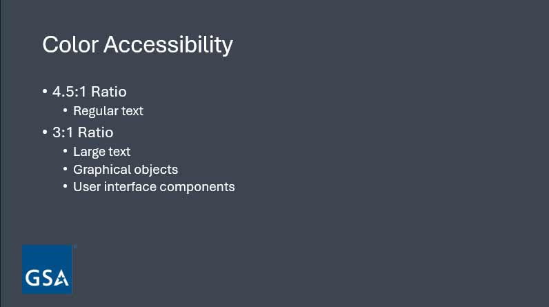
Color Contrast for Text and Large Text
Regular text must have a color contrast ratio of 4.5:1 or higher, while large text must have a ratio of 3:1 or higher. Large text is any text that is 18pt or larger, or if it is 14pt or larger and bolded.
These contrast thresholds apply even in the following circumstances:
- The text functions as placeholder text
- The text changes when a pointer hovers over the text, or when the text is part of an object that has keyboard focus (like the text of a button label)
The text in the “Sample Text” column of the following table does not meet color contrast thresholds.
| Type of text | Sample text | Colors Used | Color Contrast Ratio | Accessible? |
|---|---|---|---|---|
| Large text (non-bold 18pt) | This is large text. | Text: Light grey (#CCCCCC) Background: White (#FFFFFF) |
1.6:1 | No—Color contrast ratio is less than 3:1 |
| 14pt bold text (bold 14pt) | This is bold text. | Text: Medium blue (#3A76D5) Background: Dark blue (#073763) |
2.7:1 | No—Color contrast ratio is less than 3:1 |
| Regular text (non-bold 14pt) | This is regular text. | Text: Orange (#B56109) Background: White (#FFFFFF) |
4.4:1 | No—Color contrast ratio is less than 4.5:1 |
The following table contains the same three examples of sample text, but now they meet the required color contrast thresholds.
| Type of text | Sample text | Colors Used | Color Contrast Ratio | Accessible? |
|---|---|---|---|---|
| Large text (non-bold 18pt) | This is large text. | Text: Medium grey (#919191) Background: White (#FFFFFF) |
3.15:1 | Yes—Color contrast ratio is more than 3:1 |
| 14pt bold text (bold 14pt) | This is bold text. | Text: Medium blue (#4DA0E6) Background: Dark blue (#073763) |
4.3:1 | Yes—Color contrast ratio is more than 3:1 |
| Regular text (non-bold 14pt) | This is regular text. | Text: Orange (#916333) Background: White (#FFFFFF) |
5.2:1 | Yes—Color contrast ratio is more than 4.5:1 |
Color Contrast for Images and Graphics
Even though WCAG 2.1 has not yet been incorporated into the Section 508 Standards, it is still a best practice to follow the current WCAG 2.1 requirements for colors in non-text content.
Whenever possible, images and graphics should have a color contrast ratio of at least 3:1 whenever they are used to convey information the reader needs to understand.
In the following example, the first image has a menu icon that is light grey on a white background, which is too low contrast and is not accessible. The second image has a menu icon that is dark grey on a white background, which has a color contrast ratio over 3:1, so it is accessible.
-

Figure 12: Light grey (#9C9C9C) on white background (#FFFFFF). Color contrast ratio is 2.7, which is below the standard for graphics and interfaces.
-

Figure 13: Dark grey (#7A7A7A) on white background (#FFFFFF). Color contrast ratio is 4.3, which meets the standard for graphics and interfaces.
When Color Contrast Requirements Do Not Apply
The only areas where you are not required to meet color contrast standards are for logos and incidental text and images.
For logos, you do not need to meet any specific color contrast threshold unless it has a functional purpose, like providing a link to your home page. If your logo is functioning as a link, it must have at least a 3:1 color contrast ratio with the colors around it.
In this first example, the logo can be low contrast because it is a decorative footer in a PowerPoint presentation.
In this second example, the logo has high contrast because it has a functional purpose as a link to the site’s home page.
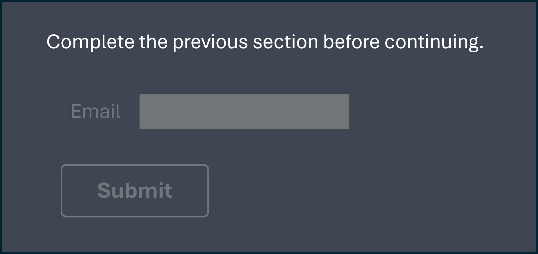
Incidental text and images describe any of the following types of content:
- User interface components that are in an “inactive” state
- Text and images that are for decoration only and are not intended to convey any specific meaning
- Content that is not visible to anyone
- Parts of an image or graphic that do not contribute to the image’s meaning and are not included in what the graphic is meant to communicate
Review the following examples of incidental text and graphics that do not need to meet color contrast thresholds.
This user interface has an input box called “Email” and a button labeled “Submit.” They are inactive, and the text above it reads, “Complete the previous section before continuing.” The inactive form field and button can be low contrast since they are currently inactive.
This PowerPoint slide has decorative shapes along the border, and decorative text along the lower edge that repeats the name of the presentation. These elements are only decorative, so they do not have to meet any color contrast threshold.
In this photo, the image conveys that a student is shopping for textbooks. The content of the book covers are not relevant, so they do not need to meet any color contrast threshold.

Color Accessibility Checklist
Use the following table as you check your ICT for color accessibility.
| Section 508 Standard | Standard Description |
|---|---|
| WCAG 1.4.1 Use of Color (for documents and web content) | Color is not used as the only visual means of conveying information, indicating an action, prompting a response, or distinguishing a visual element. |
| WCAG 1.4.3 Contrast (Minimum) (for documents and web content) |
Regular text has a contrast ratio of at least 4.5:1. Large-scale text (non-bold 18pt or larger, or bold 14pt or larger) has a contrast ratio of at least 3:1. |
| WCAG 1.4.11 Non-text Contrast from WCAG 2.1 (not required by Section 508; applies to software, documents, and web content) | Icons and meaningful graphics (like user interface elements) have a contrast ratio of at least 3:1. |
| Section 508 407.2 Contrast (hardware only) | Keys, controls, characters, and symbols have high color contrast (light text and images on a dark background or dark text and images on a light background). |